An Interesting Communication
A letter to to Mr. Evanuk from a fellow ink collector.
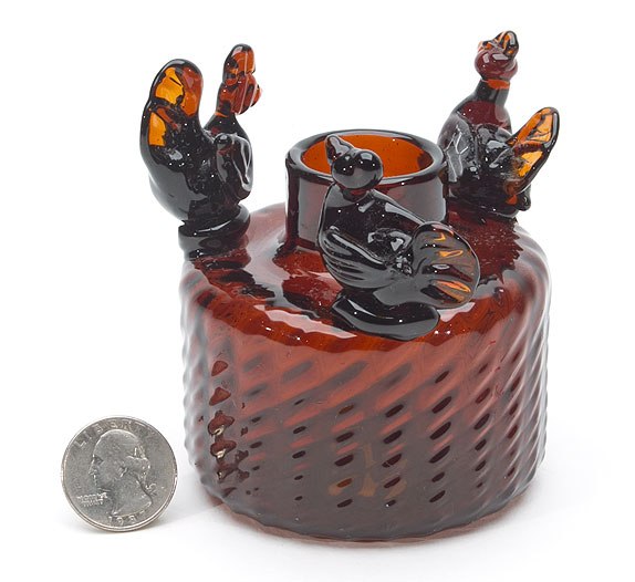
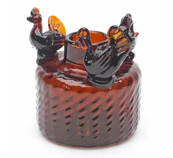
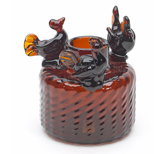
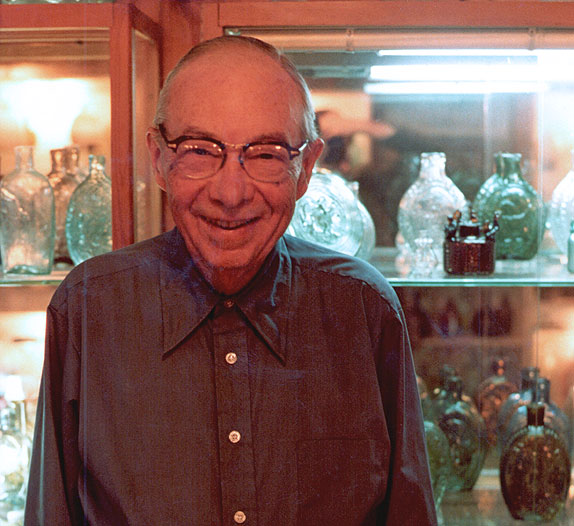
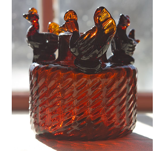
Pictured above is one of the "Bird" inks mentioned in the letter below. This ink from the Alan Evanuk collection will be offered in our March 19-28, 2018, Premier Auction 159. This ink has an exciting provenance: ex Henry Francis du Pont collection, ex George Austin collection (pictured above with the ink), ex Charles Moore collection, and Alan Evanuk collection.
Monday, October 7, 1985
Hi,
We have never met. However due to our mutual interest in early American bottles and flasks and, unfortunately for me, in inks specifically you have had a profound impact on my collecting.
The Gotjen Sales of this past winter were a time of great expectation for me. However great expectation quickly soured to deep disappointment as I missed out on ink after ink to "a very private and determined early American glass collector from Connecticut." ... None-the-less, my curiosity was killing me. I was determined to discover the identity of the reticent "JPF" buyer.
Before I forget, let me at least personally congratulate you on the acquisition of the "JPF" and, the "Horse and Rider" inks. In my opinion, they and the gallon blue "Harrision's" are the top three commercially produced inks in existence. Of course nothing within the ink category can match the historical significance of the "JPF". Had you not taken part of my available capital out of play by letting me have the annular ring Blown-3-Mold ink, I'd have probably pushed the "JPF" a little higher... Elated as I was that night over the three inks I did obtain, I was shocked that I'd missed out on both the main inks.
I've scaled my ink collection back to a handful of personal favorites and my small groupings of Blown-3-Mold and Teakettle inks. I intend to remain very competitive for Blown-3-Mold inks in patterns and colors and for teakettles in colors I do not yet have. Additionally, I'd like a mint melon ink. Even though I was the underbidder on the swirled example, I still can't believe I let you take both of the Gotjen examples. However I have to admit, had I been able to afford them, I would also have wanted both for comparison purposes. The swirled melon ink is exceptional. Congratulations again.
Consistent with the new direction of my ink collecting, I've sold off many of my figural inks, pontiled umbrellas, the remainder of my pontiled masters, and several of the pontiled embossed inks which I'd earlier felt compelled to keep in order to be competitive in all the subgroups. It's unfortunate I didn't get your address sooner as there were a few inks sold which I think may have interested you. Once I made the decision to sell, I was amazed at how quickly the inks sold - primarily by word of mouth.
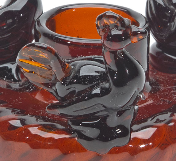
I am left with only one ink which I've somewhat ambivalently decided to offer for sale at this time. That ink is my most significant bottle. It is... Covill's figure #1165, the "Bird" ink obtained from Chuck Moore. The ink is of a brilliant light apple green glass and is sparkling mint. George Austin had obtained the matched pair (Figures #1164 and #1165) from the Henry Francis du Pont collection at Winterthur. Chuck Moore obtained the pair at the time of the sale privately of the Austin collection. The only other "Bird" ink known is the one pictured as Covill's Figure #1224. It was formerly in the collection of George McKearin and is now part of the collection of the Corning Museum of Glass.
On pages #266 and #279, Covill explains that these three inks are unique presentation pieces. To those aficionados who have been fortunate enough to be familiar with these inks, they have long been considered the very finest of blown inks on a plateau far above the commercially blown product inks. They are much more than inks. They are superlative examples of early American blown glass.
Figures #1164 and #1165 are much larger and more imposing than the aqua #1224. Furthermore, while the birds of #1224 may be nothing more than fanciful adornment, the birds of the two Ohio pieces have a forcefulness of purpose not found in any other example of blown glass. They are the embodiment of real life drama.
If one carefully examines the birds of #1165, they quite clearly depict a rather plucky rooster (with top notch) happily chasing two plump hens into eternity. The light color of the ink and its unbroken swirl lend an air of gaiety and swiftness to the pursuit. The master glass blower has clearly contrasted the lightness of moos in #1165 with the seriousness of confrontation in #1164.
On #1164 we find two roosters (with top notches) trapped head to head in endless dispute over the cute little hen clucking off the opposite side of the bottle. The ink's broken swirl accentuates the discord of the moment while its amber color shrouds the would be suitors in the hopelessness of this sad eternal triangle.
This matched pair of inks is the only effort known of a glass blower attempting to impact a moral tone to his master work. They are unquestionable bench marks par excellence in the field of early American blown glass.
The three "Bird" inks are in a class of their own - perhaps I should have said stratosphere of their own. Nothing else in the ink category can compare with them as great classics of early American blown glass.
With your broad experience in the field of both early American blown glass and inks, I'm confident you appreciate the importance of this great rarity.
I hope this letter will help us get acquainted. Whether you decide to take the bottle or not, I'd still enjoy hearing from you. Please write or feel free to call me at my home.
Sincerely,
An Ink Friend
Home | Consigning | About Heckler | Upcoming Auctions & Events | Past Auctions | News | Map and Directions | Contact
79 Bradford Corner Road, Woodstock Valley, CT 06282 | info@hecklerauction.com | (860) 974-1634

© 2024 Norman C. Heckler & Company